There are plenty of methods out there for machine learning model interpretability with fancy names but what is lacking in all of them?
ICE and Partial Dependence Plots in LIME fail to tell me the accuracy surrounding the fitted relationship. Further, ICE doesn’t exactly tell me the probability of each of the lines occurring. Your model can overfit or underfit your data pretty easily, especially if you are using deep learning models. LIME (should be called LAME) fails to tell me how the model actually performs.
Imagine you are working on a price elasticity model that will guide pricing decisions. Currently you would show the relationship that the model was able to fit. Given that we will be using a model to guide pricing decisions, a sensible stakeholder might ask, “I see the relationship that your model fit, but how do I know that corresponds to the actual relationship?”
What do you do? Give the stakeholder some model accuracy metrics? Tell them that you used deep learning so they should just trust it because it is state-of-the-art technology?
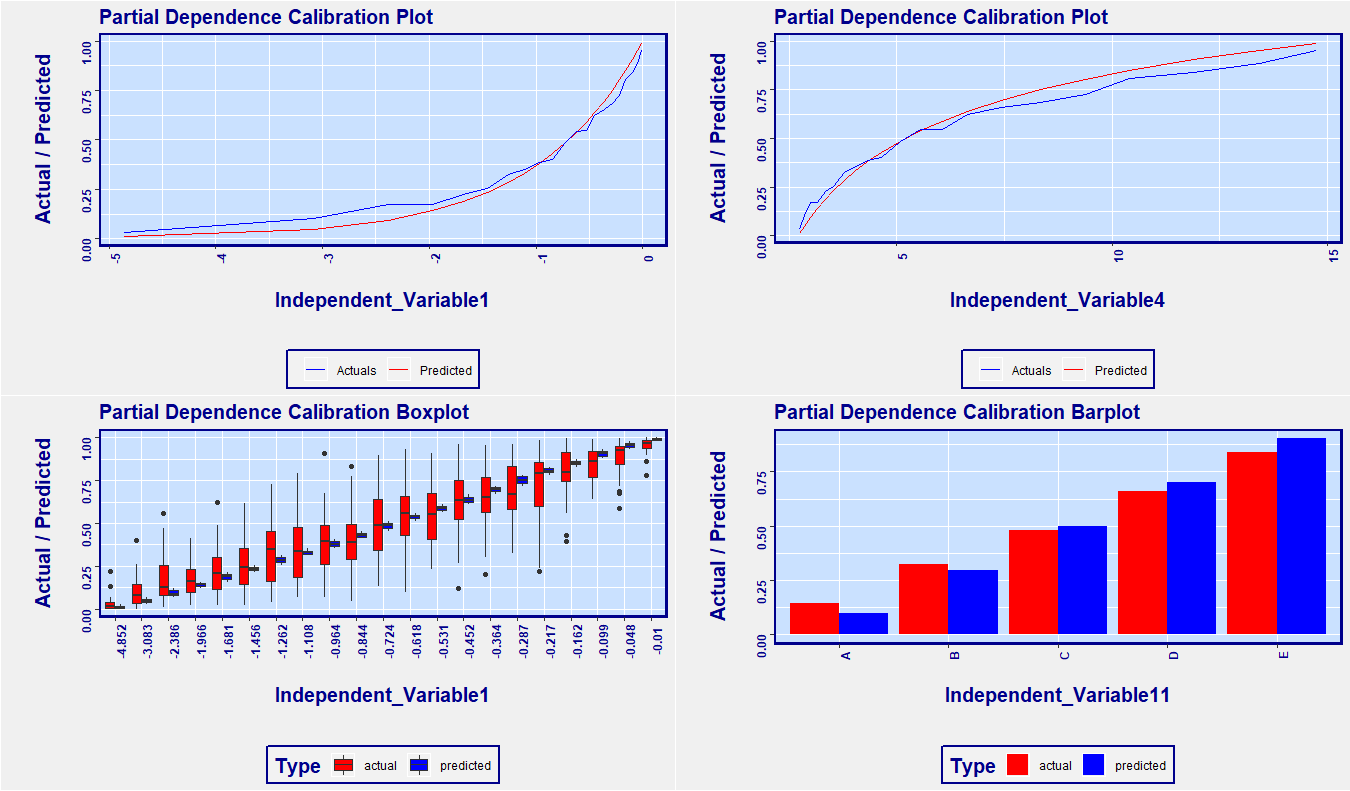
Here is a simple solution to the shortfall of partial dependence plots: Use calibration on your predicted relationship. It’s that simple. Below is an example plot from the RemixAutoML package in R. The x-axis is the independent variable of interest. The spacing between ticks are based on percentiles of the distribution of the independent variable. What that means is that, across the x-axis, the data is uniformly distributed, so no need for the dashes as shown above in the ICE chart. Secondly, we can see the relationship of the independent variable as it relates to the target variable, as does the partial dependence plots, but we can also see how good a fit the model has across the range of the independent variable. This addresses the skepticism from your stakeholders about the accuracy of your predictions. If you want to see the variability of your predictions, use the boxplot version too. If you want to see the relationship for specific group, simply subset your data so only that group of interest is included, and rerun the function.
<pre class="wp-block-syntaxhighlighter-code"> #######################################################
# Create data to simulate validation data with predicted values
#######################################################
# Correl: This is the correlation used to determine how correlated the variables are to
# the target variable. Switch it up (between 0 and 1) to see how the charts below change.
Correl <- 0.85
data <- data.table::data.table(Target = runif(1000))
#  Mock independent variables - they are correlated variables with
# various transformations so you can see different kinds of relationships
# in the charts below
# Helper columns for creating simulated variables
data[, x1 := qnorm(Target)]
data[, x2 := runif(1000)]
# Create one variable at a time
data[, Independent_Variable1 := log(pnorm(Correl * x1 +
                        	sqrt(1-Correl^2) * qnorm(x2)))]
data[, Independent_Variable2 := (pnorm(Correl * x1 +
                                   	sqrt(1-Correl^2) * qnorm(x2)))]
data[, Independent_Variable3 := exp(pnorm(Correl * x1 +
                                      	sqrt(1-Correl^2) * qnorm(x2)))]
data[, Independent_Variable4 := exp(exp(pnorm(Correl * x1 +
                                          	sqrt(1-Correl^2) * qnorm(x2))))]
data[, Independent_Variable5 := sqrt(pnorm(Correl * x1 +
                                       	sqrt(1-Correl^2) * qnorm(x2)))]
data[, Independent_Variable6 := (pnorm(Correl * x1 +
                                   	sqrt(1-Correl^2) * qnorm(x2)))^0.10]
data[, Independent_Variable7 := (pnorm(Correl * x1 +
                                   	sqrt(1-Correl^2) * qnorm(x2)))^0.25]
data[, Independent_Variable8 := (pnorm(Correl * x1 +
                                   	sqrt(1-Correl^2) * qnorm(x2)))^0.75]
data[, Independent_Variable9 := (pnorm(Correl * x1 +
                                   	sqrt(1-Correl^2) * qnorm(x2)))^2]
data[, Independent_Variable10 := (pnorm(Correl * x1 +
                                    	sqrt(1-Correl^2) * qnorm(x2)))^4]
data[, Independent_Variable11 := ifelse(Independent_Variable2 < 0.20, "A",
                                  	ifelse(Independent_Variable2 < 0.40, "B",
                                         	ifelse(Independent_Variable2 < 0.6, "C",
                                                	ifelse(Independent_Variable2 < 0.8, "D", "E"))))]
# We’ll use this as a mock predicted value
data[, Predict := (pnorm(Correl * x1 +
                     	sqrt(1-Correl^2) * qnorm(x2)))]
# Remove the helper columns
data[, ':=' (x1 = NULL, x2 = NULL)]
# In the ParDepCalPlot() function below, note the Function argument -
# we are using mean() to aggregate our values but you
# can use quantile(x, probs = y) for quantile regression
# Partial Dependence Calibration Plot:
p1 <- RemixAutoML::ParDepCalPlots(data,
                              	PredictionColName = "Predict",
                              	TargetColName = "Target",
                              	IndepVar = "Independent_Variable1",
                              	GraphType = "calibration",
                              	PercentileBucket = 0.05,
                              	FactLevels = 10,
                              	Function = function(x) mean(x, na.rm = TRUE))
# Partial Dependence Calibration BoxPlot:  note the GraphType argument
p2 <- RemixAutoML::ParDepCalPlots(data,
                              	PredictionColName = "Predict",
                              	TargetColName = "Target",
                              	IndepVar = "Independent_Variable1",
                              	GraphType = "boxplot",
                              	PercentileBucket = 0.05,
                              	FactLevels = 10,
                              	Function = function(x) mean(x, na.rm = TRUE))
# Partial Dependence Calibration Plot:
p3 <- RemixAutoML::ParDepCalPlots(data,
                                   PredictionColName = "Predict",
                                   TargetColName = "Target",
                                   IndepVar = "Independent_Variable4",
                                   GraphType = "calibration",
                                   PercentileBucket = 0.05,
                                   FactLevels = 10,
                                   Function = function(x) mean(x, na.rm = TRUE))
# Partial Dependence Calibration BoxPlot for factor variables:
p4 <- RemixAutoML::ParDepCalPlots(data,
                                   PredictionColName = "Predict",
                                   TargetColName  = "Target",
                                   IndepVar = "Independent_Variable11",
                                   GraphType = "calibration",
                                   PercentileBucket = 0.05,
                                   FactLevels = 10,
                                   Function = function(x) mean(x, na.rm = TRUE))
# Plot all the individual graphs in a single pane
RemixAutoML::multiplot(plotlist = list(p1,p2,p3,p4), cols = 2)<img class="wp-image-587" src="https://i2.wp.com/www.remixinstitute.com/wp-content/uploads/ParDepCalPlots-MultiPlotImage-remixautoml-remix-institute-remyx-courses-2.png?fit=640%2C375&ssl=1" alt="" /></pre>
Thanks for the nice work! I have a few question. I could not really get how it uses the calibration on predicted relationship. What is the mechanism of this calibration. Simply what is calibration? We have to specify GraphType = calibration. Another question, Is partial dependence plot shows the prediction made by independent variable to target variables. Like in the graph above, independent variable 1 and predicted one is target? or independent variable actual and predicted value of independent variable.?
Thanks in Advance.
What you are seeing are the values of the target variable compared to the predicted values (red and blue lines), along the dimension of the independent variable. This lets you see if the values that you are predicting line up with that of the target variable, for all values that the independent variable takes on. A good model will show the two lines very close to each other while a poorly fit model will show a larger difference in the values of lines.
Thanks for the explanation! Partial Dependence Calibration are plot give us much better representation than the others.
Is it possible to draw graphs for multiple independent variables in a single plot.? Though I tried it did not work. It will help if we have many variables like in my case. However, the different independent variables might take a different range of values. So in that case, a single plot with multiple variables would be a problem. But it could be solved with some error and trial process to plot the variables with the same range of values